ROD 021212
ROD
Monday, 12Feb12
Power Monday
Let’s get this week rockin’ with some power moves. We’ll do a 30 seconds work/30 second rest for 5 rounds non-stop of:
- TRX finisher
- KB Push jerks (switch at halway point)
- KB hold to a figure 8 (the hold will be held in a bottoms up position)
- Half burpees
- KB High pull-catch-to a squat
______________________________________________________________________
History of our NLP Logo
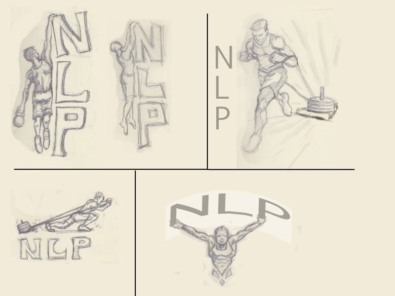
We thought it would be an interesting story on how we came about the development of the new logo. While going back and forth with our ideas we spent hours redoing and tweaking the image. The following images were the ideas being passed back and forth from the staff to our artist.
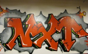
When I first walked through the doors of NLP, it was to sell off some equipment I had from my failed attempt at a CrossFit gym. I saw Juan scrubbing the floors after a class and Chris was behind the cage doing some bookeeping. Instead of buying my equipment, they asked me to become their trainer, and I accepted. I then looked up on the wall of the facility and this is what I saw. I knew immediately we had to change.
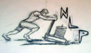
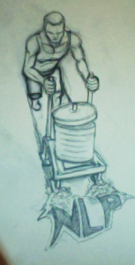
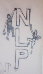
These were the first drafts of the logo. As you can see we were hooked on this sled drag thing which didn’t really pan. Also those guy’s climbing to the top of the NLP was OK but it didn’t work, not what we wanted.
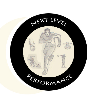
Then we agreed on the tire idea, where within the tire we would place different movements, with a runner, representing endurance, in the middle. The runner definitly had a flaw. We never run with our arms crossing the body, it’s just not efficient. Also we needed female representation within the circle because we had to, nuff” said on that.
Then someone, I can’t say who, but his name starts with a “J”, came up with the victory finish line image. We’re not in the racing business even though we’ll prepare you for one. As you can see it’s starting to come together. Also you can see the female image is evident.
Yay!! We are getting there but just not yet, as you can see by this image the runner is again crossing the arm across the body. You can tell the artist was not an athlete. The lettering was to project the movement of quickness. It didn’t make the final cut, thank goodness. Also the big guy at the top was another idea, looking as if he was overseeing the masses training.
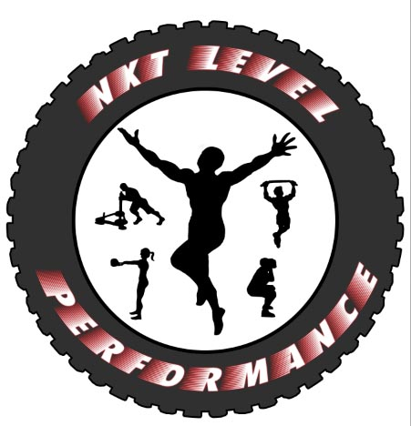
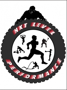
Well here we are the final cut, or what we thought was the final cut. As you can tell the runner is in perfect form. The female was swinging a heavy bell and everyone was happy, till… We decided on getting rid of the guy at the top. From a distance the logo looked like a stop watch.
This is it!! Our logo, and believe me if you recognize this symbol you know that you belong to something special. You are the hardest working fitness community on the Island. We thank you, the members of this elite community, for your support and allowing us to fulfill our passion. We will continue to bring you the best in High Intensity Strength Training on Staten Island.

![Picture_2[1]](https://nxtlevelnow.com/wp-content/uploads/2012/02/Picture_21-229x300.png)
